
CSS Positioning: You Got This!
Why is it so hard to put things where I want them?
When I first started learning HTML and CSS, I thought to myself, “Well, this is won’t be hard. I’m going to build my own custom webpage right now!” I was surprised to learn that while the syntax of CSS is straightforward and many properties are intuitive (think “color” and “border,” for example), positioning elements where I wanted them to go was not. Frustration set in: “Why doesn’t top: 100px move my elemetn down 100 pixels like the MDN documentation says it should? Did I miss a semi-colon? Did I select the element correctly?”
It turns out that some CSS properties are not stand-alone properties. When we try to position an element using “directional” properties, as I like to call them, such as top, bottom, left, and right, we first have to set a value for the position property for that element. If we don’t…well, CSS will ignore us like a spoiled housecat, and nothing will change on the page.

After reading this article, you should have a full understanding of how to use the position property to completely control the placement of elements on your page and let that housecat know who will be the boss from now on.
To get the most out of this article, you the reader should have a basic understanding of HTML and CSS, including the behavior and characteristics of the different types of HTML elements (i.e., block, inline, and inline-block). An understanding of the HTML document flow is also helpful but not required.
CSS position and directional properties overview
The position property for an element can take on any one of five values:
static fixed relative absolute stickyThe position property alone, though, doesn’t always make the element move (or move where you intend it to). Enter the “directional” properties.
The directional properties are as follows:
top right bottom left z-indexThe first four properties determine the location of the element in two dimensions and will be the focus of this article. The z-index can be thought of as adding a third dimension, and it is outside the scope of this article.
The table below summarizes the behavior of elements positioned with each of the values, except for sticky, which I will discuss in a later section below.
As can be seen in the table, the behavior of the positioned element will differ in important ways based on the value of position.
- Use with directional properties? Some values can be used with the directional properties, and others cannot.
-
Positioning Context. This defines the reference point, or starting position, for the position change.
Positioning contexts include the
- viewport: the visible area of the webpage, which will be different on each device or monitor,
- closest positioned ancestor: the parent or closest ancestor containing the element which has a position value other than static,
- HTML element <html>: the container of all elements on every webpage, and
- element itself: the element’s original position in the document flow before positioning
- Removed from document flow? Some values for position change the HTML document flow. The normal document flow (i.e., without positioning) places the elements on the page from top to bottom and left to right in the order they are specified in the HTML and in accordance with their type (i.e., block, inline, or inline-block). When an element is removed from the flow, it is as though the element is floating above the other elements on the page. The other elements appear to ignore the element and will move into the place where it used to be.
- Scroll behavior. Elements scroll with the page by default. Some values alter the expected scroll behavior.
- Reduced block width? Some values cause the width of block elements to be reduced to exactly the width of their content, which makes them behave like inline-block elements.
So, what does it look like on the page?
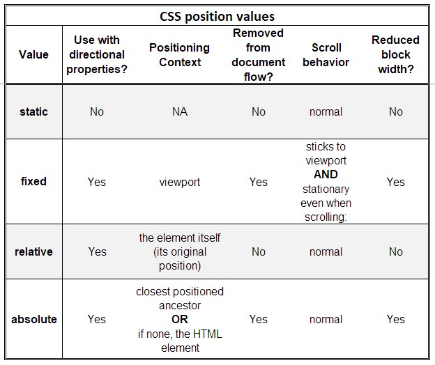
position: static
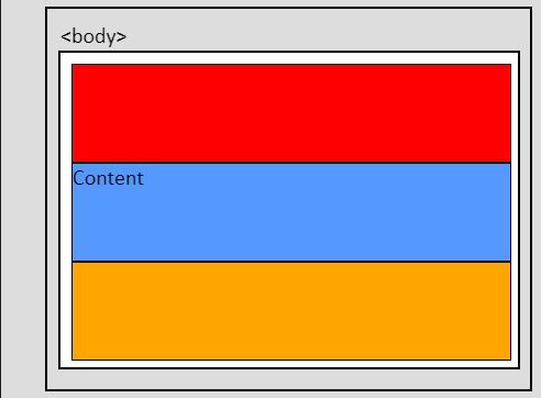
Static (static) is the default position value of all elements on a webpage. In the graphic below, three <div> elements are nested inside a parent element. This means that they are siblings of each other. The parent element is inside the <body> element. No position values have been applied. Therefore, they all have position: static. Note also that that the blue <div> has some content.
position: fixed
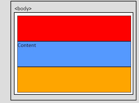
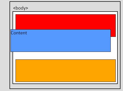
Now, let’s apply position: fixed to the blue element without directional properties and watch for changes.
The blue element has now been taken out of the flow. The orange element moved up to take its place, and it is now sitting under the blue element. The blue element also has been reduced to the width of its content.
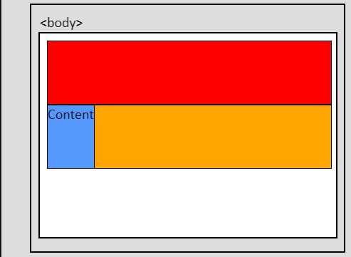
Now let’s position the box to the upper left corner of its positioning context, which is the viewport, by applying top: 0 and left: 0.
If we now scroll down the page, we’ll see that the blue box stays put, but all of the other elements scroll up:
position: relative
Let’s now remove the directional properties and replace position: fixed with position: relative and see what will change.
Interesting. The page looks just like it did before any positioning was applied. This is because the element remains in the flow and we haven’t set a direction for it to move in yet.
We can verify that the positioning context is the image itself by applying top: 0 and left: 0 and noting that the blue <div> still does not move.
It will move, though if we set non-zero values to top and left. For example, let’s set top: -30px and left: -20px.
The image moved up and to the left because the directional properties give the direction that the “push” is coming from. When the value is negative, it’s as if the push came from the opposite direction. We can verify this by removing the settings for top and left and setting bottom: 30px and right: 20px and noting that the image stays the same.
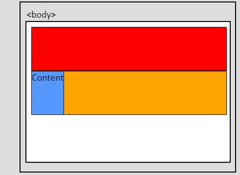
position: absolute
With only position: absolute applied, let’s see how the element behaves. It will behave in the same way whether there are positioned ancestors or not at this point, because we have not “moved” the element yet with directional properties.
Let's apply position: relative to the parent element and move the blue element using top: 0 and left: 0.
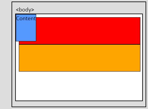
As expected, the element moved to the top left corner of the parent element.
position: sticky
When an element is positioned using sticky, its behavior is best described as a hybrid of fixed and relative, except that the element’s width will not be reduced to the width of the content. Whether the element is behaving like it is positioned using fixed or relative at any given time depends on the user’s scroll position.
If we only set position: sticky, we might as well not bother, because nothing about the appearance or behavior of the page will change. We need to also set at least one directional property.
With position: sticky, and top: 0 and left: 0, the initial appearance does not change, but let’s watch what happens when the user scrolls the page.
The element behaves as though it has position: relative until it reaches the specified location (i.e., top: 0 and left: 0). At that point, it begins to behave like position: fixed. However, a sticky element cannot leave its parent container, so as the parent scrolls off the page, the element goes with it. Also, because a sticky element must stay within its parent, its positioning context is a little different than expected.
That's it!
Congratulations! You have tamed the position beast, and it will now succumb to your will.
Good kitty.


Andrea Martz
Andrea Martz is a rising self-taught web developer and jack-of-all-trades in professional certification testing. She has worked 100% remotely for most of her career. As the only employee at a small company, she improved products and processes to reduce costs and enhance client engagement and satisfaction.
Andrea is happiest when there is variety in her work, interesting problems to solve, and the chance to collaborate, because that almost always means she’ll get to learn new skills and help others learn also.
Learn Digital Skills
Find out when the next cohort begins!
The most comprehensive program to up your game in the remote career world.
Learn More