Extending Flexbox To Existing Nested Div Elements
How to use Flexbox to div elements to achieve flexible layouts for website.
As a beginner in web development struggling with making my web page items “behave” using float was extremely hard and inconsistent. So, when I read about flexbox and how the “flex"ibility was going to be the answer for everything, I was over the moon. However, when I started using it in my project, I had entirely different feelings.
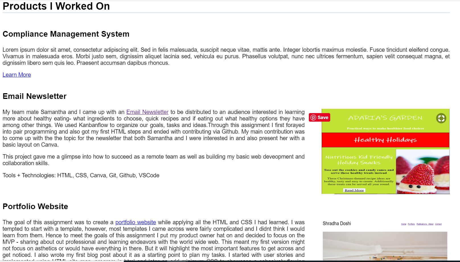
Below you see my portfolio which was styled with the use of a float
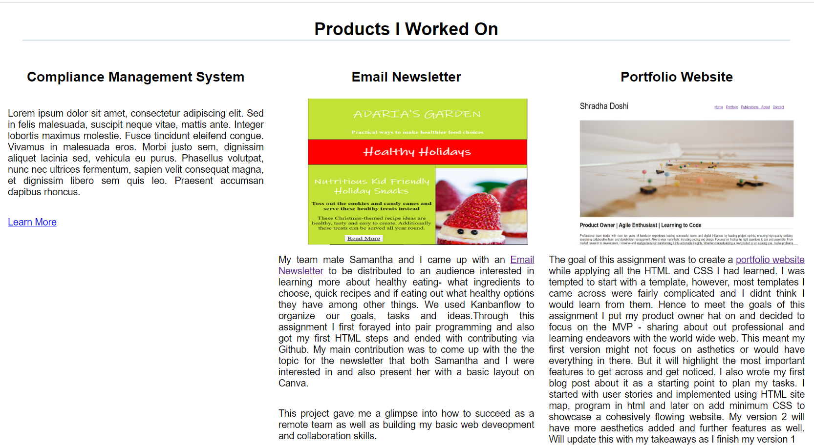
..and this is what I was able to achieve using flexbox
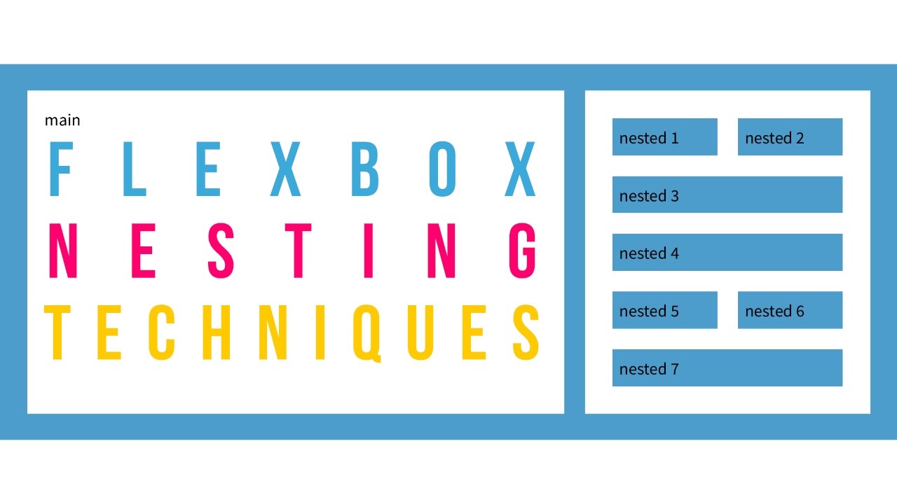
The basic tutorials on flexbox syntax showed how I can move the items under portfolio adjacent to each other with row and column properties.I really thought I found my magic solution in flexbox. I truly believed “display: flex; “ was the answer to all my problems. Until I started applying Flexbox to nested div behave very differently when using flexbox.
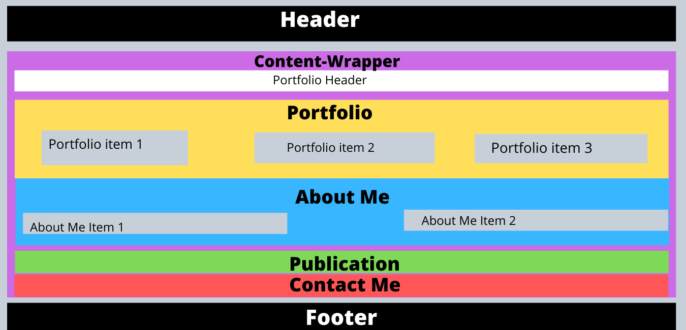
Here is a before wireframe which is the very basis of all my div elements in my html-
Notice that I didn’t account for the container that holds portfolio header, portfolio, about me, publication, contact me aka the purple container. I was applying flexbox to parent “portfolio” and the child “portfolio items” and it wouldn’t take effect, no matter what I did. Or all sections within purple container would overlap over each other making the content unreadable.
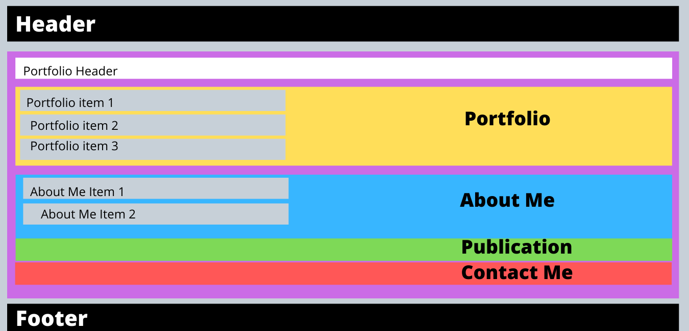
Here is my after -
Few changes I made are as below-
- HTML Change: I add a div element of ”content-wrapper” which is now parent to child items portfolio, about me, publication and contact me. These again hold their own child items
- CSS Changes: After having made this change in html, I removed all percent height attributes within nested elements
- Also, added display flex to all parent and child and grandchild items
- Content-Wrapper: I set
flex-direction:column;This makes sure portfolio, about me, publication, contact me are one below another - Portfolio, About me: I set
flex-direction:row;. The makes sure their child items are set in a row fashion adjacent to each other. Also setting parent to align-items: stretch; makes sure the child items will stretch across whole cross axis which is vertical by default and the flexbox items fill up the whole vertical space. - Portfolio-items: In order to view each portfolio items adjacent to each other in one row and take similar space I utilized flex property to set flex-basis using the syntax
flex: 0 0 33.3333%; - I also created some separation between each portfolio-items by setting margin: 0 10px; Flexbox items stick to each other by default.
Conclusion: It is important to know that flexbox is a one dimensional layout which enforces us to think in either row or column and the content flows from left-right or top to bottom.
Resources:

Shradha Doshi
Shradha Doshi is a product owner, an entrepreneur a mom of 2 girls and an aspiring web developer. She firmly believes in user centric, empathy based design and how products and websites built with these principles help bring communities together. She loves working in product management and development since it allows her to practice her passion in design, finding solutions that work for masses and where she gets to change lens between big picture and minute details. Her future goals include empowering stay at home parents especially mothers trying to get back into the workforce based on her own journey and share the lessons she’s learned along the way. When she isnt working, she loves cooking, spending time with her husband and 2 kids and doing arts and crafts with them.Learn Digital Skills
Find out when the next cohort begins!
The most comprehensive program to up your game in the remote career world.
Learn More