We Can Be (Design) Heroes: Visual Hierarchy and Creating the Hero Image using HTML/CSS
“Intuitive design is how we give the user new superpowers."
For many, there is a degree of mysticism that surrounds the creation of websites and the developers that build them. Before I stepped into a developer role myself, I viewed many of the programmers I worked with as magicians, and as a marketing professional I envied the superpowers they wielded as they spoke of mysterious “stylesheets” and performed miracles to make the elements on my screen do amazing things. As my career evolved, I witnessed the many different components, steps, and people involved in redesigning a single website. Account managers, designers, developers, content producers and more came together to fight the evils of outdated tech.
Depending on your own goals as a new front-end or full-stack developer, you will likely need to understand some fundamentals of design yourself, for individual or team projects. Good design practices don’t always come easily to new web developers; it’s one thing to learn different coding languages and how to produce particular visual elements in a browser, it's another to make them come together cohesively to create a user-friendly website. But anyone can learn how to think like a designer with practice.
In today's post, I’m going to layout some fundamental principles of good design for developers, expand on the design concept of visual hierarchy and tell you how to create a hero image using HTML and CSS as a device for achieving that hierarchy.
So, let’s start with the fundamentals...
Design Fundamentals: An Overview
I have personally found Anahat Rawal’s summary of design fundamentals for graphic design very helpful as a jumping off point for thinking in a more design-orientated fashion. She describes these eight principles for creating better design:
1. Balance. Balance is just what it sounds like; it’s about using elements in a fashion that creates a sense of visual stability and structure on your website. You might achieve balance, for example, by creating one content block that has an image on the left and text on the right, then switching the next content block on your website by putting the image on the right and text on the left. You can achieve web design visual harmony with either symmetrical or asymmetrical balance.
2. Proximity. This is a means visually grouping elements together, or connecting them to each other on your website. It isn't just about element's distance or closeness, but can be achieved by using similar color, font, size etc. as a means of connection. Proximity is easy to create in HTML/CSS by creating and styling div tags. More or less actual space between elements can can be achieved using margins and padding in CSS, and similar fonts, sizing, etc. can be assigned to groups of elements.
3. Color. Colors set mood and tone, are important for branding purposes, and can complement or conflict on your site. They can also have an impact on eye strain for your users.
4. Alignment. This is pretty self-explanatory, but is important because it creates order and cohesion amongst the elements on your page.
5. Repetition. This ties visual elements together (like logo and colors used on site) to create rhythm; is particularly important for visual cohesion and branding.
6. Typography. The fonts you choose influence how users view brand personality, readability of text and accessibility of the information you’re presenting on a website.
7. Contrast. Contrast is what you get when there are visual differences between elements on your website. It can be a very important principle when it comes to user experience, also affecting readability. As a developer, making sure there is enough contrast between the background and the text elements on it is a really simple way to help website users get the most out of their experience. To create better contrast, you may want to use CSS to add opacity to background images or change font colors to make text stand out.
8. Visual Hierarchy. More on this below.
Now Let's Chat More About Visual Hierarchy
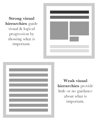
When you think of hierarchy, you probably think of a top-down organization of some sort, like a business. You’ve got your president or CEO at the top, as the leader and face of your organization, and then your vice presidents, directors, managers and so on all the way to front-line employees. Frequently, salaries and responsibilities differ based on the hierarchical organization of company employees. This method of organization isn’t just limited to groups of people, however; hierarchy is important in web design/development and organizing information and images as well.
In design, visual hierarchy is how you order and present elements within your overall design, and how you arrange them to establish their importance. For example, you may want to put vital information and content towards the top of a webpage, and find additional ways to make it stand out to a viewer by making it larger. Hierarchy helps your audience quickly access and unconsciously establish what elements require their attention first, and allows them to make general sense of what you’re attempting to communicate in a snap. It’s a means of visual prioritization. It also allows designers and developers to communicate the most relevant messages first, highlight a call to action, establish a brand, and help connect visitors to the highest-priority content.
Wireframing and mapping content can be vital steps added to the web design process to help you create a visual hierarchy that works. Look at other websites for inspiration too; what do you notice first about the website? Second? What content grabs your attention? These exercises will help you to notice and implement appropriate hierarchy in the design of your own projects.
So, hierarchy is essentially a difference in prominence amongst your various visual elements and content. In practice, this can be easily achieved through consideration of some of the other fundamentals of design highlighted earlier, such as:
1. Placement of elements (e.g. top to bottom)
2. The sizing of elements (i.e. big vs. small)
3. Contrast amongst color choices and images
4. Spacing and proximity of elements
5. Alignment of elements
As well as several others. There are many snippets of code you can use to incoporate good design principles into your work, and create visual heirarchy on a page.
Although one of many tactics, one of my favorite devices for establishing hierarchy on a website as a junior developer is the hero image.
How to Create a Hero Image Using HTML and CSS
You can’t browse the web without bumping into a hero image; the large banner image across the top of a website overlaid with text draws your eye immediately. A hero image can be the very first visual point of contact a user makes with your site, and they are a great opportunity to briefly establish what a site (and brand) is all about in one glance and draw the user in. Theses images are also very responsive, ensuring it displays well across devices.
But how do you code it?
1. First, update your HTML by creating div tags for your image and related text, like the example below:
2. Then, add your CSS, which might look something like the following example:
Your end result should look something like this:

And it’s that easy! Just adjust the code above for your site, and you’ve got yourself a hero image. Check it on your desktop and mobile device. You will likely need to made adjustments; you may need to resize your original image or find a new image depending on the display quality. While the hero image is only one of many ways to create visual hierarchy, you’re well on your way to organizing the content on your website to create a purposeful user experience.
Next Steps
I hope you’ve found this post to be a fruitful first step on your coding journey. I encourage you to further explore the endless possibilities for using HTML and CSS to create well-designed web pages with the list of helpful links below.
Helpful Links
Principles of Design for Coders
10 Basic Principles of Graphic Design
12 Visual Hierarchy Design Principles Every Designer Should Know

Claire Helland
Claire Helland is part-time Marketing and E-Commerce Consultant, MomsCanCo. coding student and joyful full-time Mama of a spirited toddler. Informed by over seven years experience working with airlines, and degrees in science and business, Claire is a small-business “Swiss-Army knife” with skills in branding, web design, integrated marketing communications, Public Relations and more. Claire has worked with domestic and international teams to successfully manage multiple website redesign and e-commerce implementations and develop practical, budget-friendly strategies to help bring small and mid-sized airline networks into the modern age. She champions a data-driven, authentic and holistic approach to business communications. Constant curiosity drives Claire to dig laughably deep into research at times. A lover of learning, she is passionate about travel, tech, biological sciences (especially neuroscience), food, art and motherhood. She is currently focused on becoming a front-end developer and raising her son, but she continues to offer a limited amount of marketing consulting through PaxIQ. This transition has been driven by her desire to expand on her digital marketing experience with new skills, long-term goals to work remotely full-time and travel with her family, and her interest emerging technology.Learn Digital Skills
Find out when the next cohort begins!
The most comprehensive program to up your game in the remote career world.
Learn More